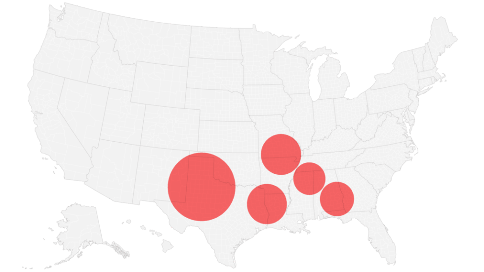
What are the most vulnerable parts of the US vaccination landscape?

Goal: We aim to identify clusters of counties which have lower vaccination coverage than expected compared to the national average.

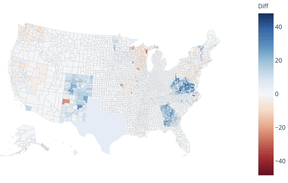
Methods: To detect clusters of low vaccination, we use the Kulldorff scan statistic (SaTScan). The analysis identifies candidate clusters centered at locations around the US, and having a maximum specified population size (of 1% of the total population size). For each of these candidates, the observed number of vaccination cases is compared to the expected number of cases (based on the national average). A candidate cluster is reported as a cluster if there are fewer observed cases than expected, and this outcome is likely to have not occurred by random chance. (The analysis is based on data available up to June 28, 2021).

Findings: The group of counties in each cluster (shown on the right) together have lower vaccination coverage than expected, and make up a large population size. All of the top five clusters are focused in the southeastern US. The locations in the clusters are smaller than the average US county: 92% of cluster counties have a population size of less than 100,000.

Based on latest data as of July 7, 2021

Why is this important?

Humans don’t interact with each other randomly; we are more likely to interact with people living near us than those living farther away. So, the more geographically clustered unvaccinated individuals are, the higher the chance that an unvaccinated individual will interact with another unvaccinated individual, and the higher the chance that a disease transmission event will occur. Low vaccination clusters, therefore, are locations where risk of transmission of COVID-19 remains high (in the absence of social distancing and masking).

What are the implications?

Variant emergence stems from disease transmission. Every disease transmission event creates an opportunity for a new variant to transmit to another host and take hold in a population. Therefore curbing transmission events is our best recourse to prevent variant emergence. The COVID-19 vaccines currently in use in the US are highly effective against transmission. Because the clusters of low vaccination do not have this protection against transmission, transmission risk remains high there (in the absence of social distancing and masking).

What is the difference in vaccination data reporting between the CDC and states?

Findings: In comparing state-reported vaccination data and CDC-reported data, we find significant differences. The map (on the right) shows the difference in complete vaccination coverage as reported by the CDC and the respective states. Shades of blue denote that the CDC reports underestimate vaccination coverage, and shades of red denote that CDC reports overestimate coverage. Texas is not included as there are no data reported for Texas by the CDC. (The analysis is based on data available up to June 28, 2021.)

Why is this important?

Maximizing vaccination requires that we track vaccination patterns to measure the progress of the vaccination campaign and target locations that may be undervaccinated. It is also crucial to carry out vaccination tracking at fine geographic scales like county-level as tracking vaccination at the state-level can obscure pockets of susceptibility.

What are the implications?

It is important that we track vaccination progress accurately as under- or over-estimation of vaccination coverage can lead to an unwarranted redistribution of resources away from communities in need.